Showing posts with label Interior Details. Show all posts

Interior Details: Painted Trim

 
Today's Heath and Andy's technical move in day!  Eeek!!  I'm SO excited for them!  My sweet dad has offered to paint most of the interior of their house for them to save money.   (They need those pennies for other more expensive projects that the house needs - their kitchen currently has four different countertop materials!  Their pennies need to go towards fixing a few things like that!)

We've been brain storming different paint options all week and we've landed on a palette I think they'll love.  They're going with a primarily all white, fresh, clean look, but in the back guest bedroom they're going to paint the trim a different color.  I'm loving the look of painted trim and I'm wanting to incorporate it somewhere in my house.  (I'm out of rooms though so it isn't getting incorporated!)  I've long loved the look of painted walls and trim in the exact same color - it's such a statement - but there's something fun about a white room with painted trim, don't you think? 

Would you paint your trim something other than white?

~Mary Keller

images here

Photo Follow Up


MK mentioned that she finally got her photos organized in February (sadly loosing 1,000+ of them with her old iPhone went a long way in getting this job done) so we wanted to share a few things that stuck out in getting this done.

I read somewhere, do not start by going back through all of your old photos and trying to get them organized.  It's too difficult of a task!  Develop a new system and then implement that system moving forward.  At least all of your new photos will be organized moving forward, and you can go back bit by bit when you have time to work on old photos.

This concept resonated with me big time. I've actually been doing really well with my photo process since we started blogging. I upload my photos regularly by event and even started backing up our computers. So mostly this concept just made me feel a little less guilty about the 1000+ photos I have stored on our external hard drive that aren't printed or even in a book in our home. It's so sad but I didn't have a routine at the time so I just never got around to it. I'm hoping I'll get to it fairly soon with this new organization though.

If you're curious, here's the system we landed on:  

1 - Use an IPhone reminder for one night a month to upload miscellaneous iPhone and camera photos 
2 - Unload vacation/event photos within a week 
3 - Save them to an online photos site(flickr etc)
4 - Organize into events and labeled folders with dates 
5 - Go through quickly to delete duplicates and out of focus shots
6 - Organize photos into preferred sequential order for photo book 
7 - Prepare photo book! 
 8 - Print and frame photos!! 

We know this isn't breaking news but this process has really helped us get more organized so we though we'd share. Any other tips or tricks we should know?

Next on the list - photo books and framing!

- Heath

image via 

Interiors Details | Decorating with Color


This weekend as we were setting up for the LaRoque mini trunk show we got to talking about interiors.  Annabelle was commenting on the color of MK's dining room (you can see it here) and how institutional her home was going to feel when she returned home.  (Although we know her home is probably gorgeous!)  She explained she has all white walls, trim and doors and after seeing MK's home with a green dining room, grass clothed guest room and the occasional black door that her home felt too white.  I knew exactly what she meant but it's such a tricky in between don't you think?


I've never seen Annabelle's home but I know it's gorgeous based on her designs and taste I've seen so far.  But it got me thinking about how I use color in my home, or really for me there's a serious lack of color! Right now it feels right though, it feels comfortable for now. 


How much color do you use in your home? I'm not really into white so my home is more neutrals at this point but I'm so curious what I'll do with a future home that I spend a little more time/money decorating!

- Heath

onetwothreefourfive; sixseven

Copy This | Genius Pegboard


I clicked over to this amazing, pure genius, pegboard project the other day from this (also amazing) house tour and I can't get it out of my head.  I'm recording it to do a complete copy in Virginia's room one day.  I love everything about it - it's pretty (love the spray painted gold accents), it's organized and it's got to be so much fun for a child to have all of this great art stuff at their finger tips.  I really wish I had an area to do something like this in the downstairs of our home, somewhere easy for Virginia to play, but it may have to go up tucked away in her bedroom instead.  Isn't it beautiful?  I think this system could also be used to create a really beautiful "command central" station in the kitchen for bills, mail, etc.

~Mary Keller

Photos by Alpha Smoot for Cup of Jo

Coffee Table Book Talk


Generally speaking, we aren't really planning on doing any type of traditional gift guides around here for the holidays.  (Plenty of people already do that so well, plus we don't like searching the internet for hours!)  But, we are starting to think about Christmas lists around here, and I usually have a coffee table book or two on my list.  How do you guys feel about coffee table books?  Do you love them, or find them useless?  I do like them and I enjoy flipping through them with a glass of wine after Christmas, but then I usually put them on a bookshelf and don't do much with them ever again.  Kind of a shame.  I don't usually put them on my coffee table because it feels cluttered to me for some reason - looks great in pictures, but cluttered in reality.  Do you guys agree?

Then, I read this from Jordan at Oh Happy Day - she said they got rid of their TV, piled their coffee table with fresh books, and they're loving it.  What do you guys think?  I'm not giving up TV anytime soon, but I'm wondering if I should really pull out my books and start using them.

A few coffee table book picks for 2014 Christmas Lists...

Michelle Armas' Home


You guys probably know that I've been a fan of Michelle Armas and her beautiful art for some time.  (I used one of her prints in Virginia's nursery and love it!)  Her beautiful Atlanta home was featured in the first volume of Trouve Magazine, and oh my gosh it looks amazing.  Her home is absolutely perfect, which I guess is what you would expect from a creative artist.  I love everything about it.  It's imperfect and not overly decorated.  It's filled with beautiful neutral, comfortable looking furniture pieces and colorful, unique art.  It looks collected and added to over time.  I especially love the huge long lumbar pillow on her camelback sofa.  Go see more for yourself here, and check out Trouve here.

~Mary Keller

images via Michelle Armas' blog by Paige French for Trouve.

Artist Spotlight: Whaley Connell


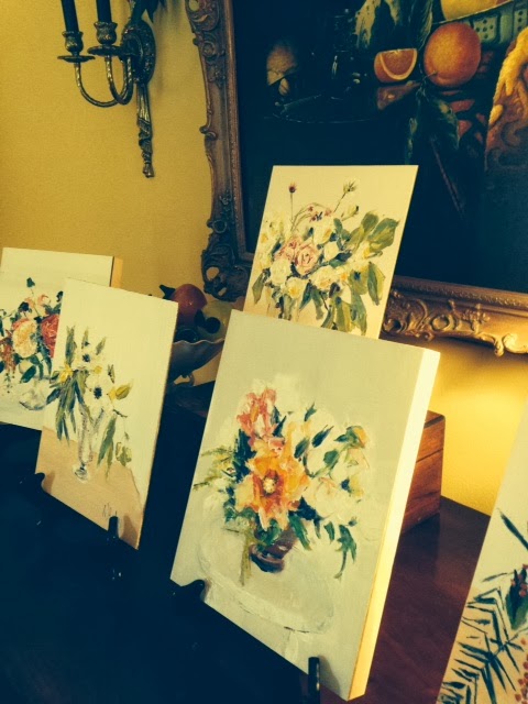
You guys my grandmother came up with the best surprise gift for all of us this Christmas.  At the end of our Christmas celebration, after all of the gifts had been upwrapped, she pulled out 4 more tiny little Christmas baggies and handed them to each of us.  Inside each baggie was a number.  Next she asked us to head to my aunt's living room where we discovered these beautiful small paintings.  My cousin's wife, Whaley Connell, is an artist and my grandmother asked Whaley to paint a small piece for each of us.  My grandmother didn't want to decide who got which piece so she came up with the idea of making us essentially draw a number.  Heath's baggie randomly had number 1 so she picked first, my bag had number 2 so I picked second, and we went on down the line.  It was such a fun surprise, but I was SO impressed with these beautiful paintings. 

If anyone would like us to put you in touch with Whaley, please let us know!  I think these would make beautiful bridal or anniversary gifts of a bride's bouquet, and their little size is perfect.  I think Whaley's work is very reasonable and you can fit a small painting like this just about anywhere!  Leave us a comment if you'd like us to pass along her email address.

p.s.  Heath picked the one all by its self on the back row.  I picked the one second in from the right with the big orange (go vols!) flower up front!  It was a tough decision that we of course overanalyzed the rest of the afternoon. :)

~Mary Keller

Starting a Collection: Demilune Table

A few months back, I did a post on starting a collection featuring artist Teil Duncan.  I love the idea of being really intentional about certain things that you purchase and bring into your home.  Not every piece of art can be a real piece of art, and not every piece of furniture can be expensive, but I think it's important to be intentional, think long term, and try to be smart about certain pieces you buy.  (Otherwise, every decade or time that you move you'll be starting from scratch.  It's better to over time collect quality pieces that you love!)

One furniture piece that I think is worthy of an "investment" is a demilune table.  If you save and decide to splurge on one piece of furniture to begin building your collection, I think a demilune table is a safe purchase.  You can use a beautiful demilune table in a million ways.  They can be used in a tight entry hall, in a den, in a narrow hallway, or even as a bedside table.  Take a look at all of these examples below:

Love this image!  This demilune table is clearly a gorgeous piece that is timeless and will never go out of style, but it still manages to look youthful and hip when paired with quirky accessories.

This image is from the same apartment as the first image.  This demilune table is in a completely different finish and works so well in this tight hallway.

Again, same shape table, but a completely different look.  The iron base and stone top have a more French look, but the table is equally timeless and could be used anywhere.  (LOVE this paint color too, and love how the door in the background is painted the same color as the hallway, trim and all.)

Beautiful wood demilune used as a beside table in this bedroom. 

Another demilune (with a dropleaf that is propped against the wall) that certainly doesn't feel granny or stuffy when paired with the convex mirror and awesome coral orange lantern.  (Notice the amazing tortoise shell trim at the ceiling?!)

Love this entry, with an understated little demilune console.

Another nice thing about a demilune table is that you don't have to spend a million dollars to get a quality piece that you'll keep forever.  (It cost a lot of money to purchase a chest, dining table, or buffet table that is a high enough quality that you'd actually want to keep it forever.)  But, for a few hundred dollars you should be able to find a demilune table at an antique store in a beautiful finish that I promise you'll use forever.  To find one, take a look at Craiglist, online auctions, ebay and local antique shops.  Look for classic lines and a wood finish that is good shape.  I think you will actually spend less on ebay and in an antique store than you would at any major big box store, and you'll have a piece with history which always gives a space a better feel.

So, moral of the story, instead of buying 2 mediocre furniture pieces with the money you've saved, purchase one quality furniture piece (maybe a demilune if you like these looks!) and then turn to Craiglist, buy something inexpensive and add a fresh coat a paint for your second piece.  I promise 20 years from now you'll be happy to at least still be using this one quality piece that you added to your collection!

~Mary Keller

Images: First image via Lonny magazine January/February 2013; Second image via Lonny magazine January/February 2013; Third image via Lonny magazine; Fourth image unknown (if you know the source for this image, please let us know and we will credit asap); Fifth image via House Beautiful;  Sixth image via Canadian House and Home

Ideas for the baby's nursery!

Most of you probably know that J.D. and I are expecting a sweet baby girl in early October.  We are both counting down the days until we get to meet her!  I've sloowly been making progress on her nursery.  I thought I was ahead of the game, but this summer is flying by and I look at her little (it's actually huge) room and wonder why it's still fairly empty.  But, I've got a game plan and I'm really excited to see it complete. 

For some reason I always knew I wanted her nursery to be bright and colorful, full of art and life.  I love sophisticated, neutral nurseries but they never felt right for our girl.  I fell in LOVE with this blue splatter paint "Jamie" pattern from Biscuit Bedding and knew it was the perfect starting point.  We're actually using our home's master bedroom for the baby's nursery.  (We sleep in a smaller room next door.)  The master bedroom is huge, we don't really do much in our room besides sleep, and we think that giving the baby the big room will give her lots of room to play, and we can maybe even fit another baby in there with her down the road. :)
So, in the baby's room we're using two twin beds with simple white inexpensive matelasse bedspreads, and then I splurged on two blue splatter paint shams to give the beds some color.  (This is a good tip if you fall in love with bedding over your budget.  I LOVE the look of simple white bedspreads, you can toss them in the wash, and then save your budget for beautiful shams.)  We bought a big antique chest at auction to use between the twin beds, and on top of the chest we will have cute accessories, picture frames and two Mint green Triple Gourd Lamps, similar to these.  Above the chest, in between the beds, we are using a bright colorful Michelle Armas piece.  (LOVE her work and wish we could spring for the real thing, but I have to remember she's a baby a print will be just fine. :)   I needed a huge rug and got this Serena and Lily Deco rug on super sale and even through it really isn't big enough, we will make it work.

The room also includes her crib and changing table.  Her crib is a simple, old fashioned white crib with the same adorable Biscuit blue splatter paint crib sheet.  Above the crib we're using a 2008 Spoleto Arts Festival poster.  (Spoleto is a huge arts festival in Charleston.  J.D. and I purchased this poster when we married in Charleston in 2008, but it's been in the closet ever since.  Happy to have a reason to put it to use!)  For her changing table we're actually using an antique sideboard we bought at auction pre-baby.  (Before finding out we were expecting, I was planning on opening an cute accessories/antique's booth.  Once we found out our baby news, we decided it was too much to take on.  So, as a result of my shopping for the booth, we're using the pieces we purchased for random other uses in our home...such as a changing table :)  I'm keeping my eye out for an old colorful floral tole lamp to use on the changing table with a bright mirror above. 

If anyone has ideas for a fun mirror, please let me know.  I haven't fallen in love with anything so I'm leaning toward painting a thrift store mirror a bright cherry color similar to a color in the Michelle Armas painting!  I'd love any suggestions.

~Mary Keller

Images 1) Jamie Sham via Biscuit Bedding; 2) Sabrina print by Michelle Armas; 3) Robert Abbey Gourd lamp via Neenas; 4) Serena and Lily Bone Deco Frame Rug; 5) Poppy Mosaic Mirror via Serena and Lily; 6) 2008 Spoleto Arts Festival poster via Post and Courier; 7) Jenny Lind crib via Amazon; 8) Jamie Crib sheet via Biscuit Bedding; 9) Sideboard via 1st Dibs

Interior Details: Gloss White Ceilings

Often when people come to our house, they comment that we have high ceilings.  I think our ceilings may be slightly taller than what you typically see around the small, old bungalows/cottages in our neighborhood, but I think our ceiling height may also be an illusion.  When we moved in our home last year, we had the ceilings and trim freshly painted.  We had a few ceilings painted in a white GLOSS finish.  It's not uncommon to see ceilings with beautiful, rich colors painted in a high gloss finish (and that's a detail I love for an entirely different post!) but it's rare to see white ceilings in a gloss finish.  People typically tend to stick to their standard matte ceiling white.

A gloss finish on a white ceiling is a hard detail to photograph because it's subtle, but I've shown a few examples below.  A few things to note, if you're going for a less noticeable finish, select a semi-gloss.  If you'd like the ceiling gloss detail to really stand out, select a high-gloss.  Our home is more traditional and we didn't really want the gloss to stand out, so we used Glidden's standard ceiling white with a Low-Luster finish.  It gives the perfect amount of sheen to add height to the room, but it doesn't stand out or drawn attention to the shine.  It's the perfect amount of shine, giving the ceilings a little glow and bouncing lamp light off of the ceiling.

Also worth nothing, if your ceilings aren't in good condition, gloss finishes will show every imperfection.  I like old imperfect homes so this doesn't bother me, but if cracks and uneven ceilings bother you, the semi-gloss and gloss will definitely make them more noticeable.  (For this reason, your painter may charge you a little more to use a semi-gloss or gloss.  They have to be more careful while painting because it does show imperfections!)

This really high gloss ceiling definitely makes this ceiling feel taller, and the ceiling becomes a design element.

This sheen level is less noticeable, likely a semi-gloss or a low-luster.  The lower sheen level does not jump out at your eye, but it helps the light reflect and bounce off the ceiling, and it keeps the ceiling from feeling as low and heavy as a matte finish would. 

Beautiful living room wood ceiling painted with a white gloss.  Again the gloss keeps the ceiling from feeling heavy.

 The really high gloss in this bedroom makes the space feel more contemporary.

This image is technically cheating because this ceiling is a pale blue gloss, but it still shows the "glowy" effect that the gloss gives a space.

Not every room will need this type of finish on the ceiling.  In our home, we only painted the ceilings in the living room and dining room (and soon our kitchen) in the low-luster gloss finish.  We like our bedrooms to feel cozy so we intentionally left those matte, not wanting those ceilings to feel higher.  

For other Interior Details, regardless of budget or style here!

~Mary Keller


First image via So Sterling and Company; Second image via AtticMag; Third image via House Beautiful; Fourth image via Apartment Therapy; Fifth image via CocoCozy

Interior Details: Tiny Frames

I majored in interior design in college and even though in my career my focus has been on Corporate Interior Design, friends often ask me for advice on decorating their home.  Giving friends (or anyone really!) decorating advice is SO tricky.  The most beautiful homes are homes that reflect the owner's taste, not their decorator's taste, Pottery Barn or West Elm's taste, or really any new Shelter magazine's taste.  I think details are what make a home special, just as the right accessories and jewelry make jeans and white t-shirt interesting. 

One detail that works well in any home, regardless of the home owner's style, budget or taste are TINY picture frames.  When I poured through old saved images to illustrate how much life tiny picture frames add to a room, examples were surprisingly hard to find.  Mostly because I noticed that in almost all of my saved design images, most were void of picture frames all together.


The image above is of Kate Spade's Manhattan apartment, and in that apartment, Kate Spade does no wrong!  She beautifully pulls off a mass collection of frames, including lots of tiny versions.  But, my favorite way to use tiny picture frames is not necessarily in a grouping like shown above.  I think they add so much charm when tucked in bookshelves between books, tucked on a tiny shelf in a bathroom, or alone on a side table with accessories.  It's difficult to see the tiny frames tucked in places in the examples below, but that's kind of the point.  Tiny frames don't jump in your face when you see a space, you gradually experience them as you spend time in someone's home, which I think makes them that much more interesting.


A few small picture frames with one larger frame.  The look would not be the same if all of the frames were larger is size.  Image of Hanna Seabrook's home on Glitter Guide.


Another lovely corner of Hanna Seabook's home with one singular frame.


A few tiny frames, combined with some larger frames, tucked in a bookcase.


VERY tiny frames on the bedside table, in one of my favorite bedrooms


A handful of small frames on a chest.
 
~ Mary Keller


Top image of Kate Spade's apartment via The Selby; second image via Glitter Guide; third image via Glitter Guide; fourth image via Lonny Magazine; fifth image via Lonny Magazine; bottom image unknown - if you know the source please let me know and I will happily give credit.

Leontine "Like" Linens


I have two small bathrooms that I'm finally going to give some attention.  Nothing major, just fresh paint, linens and accessories.  I LOVE Leontine Linens like everyone else, but they're too pricey for my budget right now!  I've been looking for a handful of different linens that achieve a similar look.  I think the trick is to avoid the standard plain solid terry cloth towel and instead try to select something with some type of detail -- a scalloped edge, colored trim detail, etc.  Also, adding an interesting monogram (versus the standards that Pottery Barn and other major retailers offers) makes a BIG difference.  Leontine Linens and Gramery have great examples of interesting monograms on their website that you can take to a local embroiderer.  I think Gramery's Matouk Esperanza towel with an interesting monogram may be my pick!

~ Mary Keller

Top image photo credit Lonny Magazine via Wayfair Blog; Second image photo credit Lonny Magazine via Design Darling Blog

Towel Round Up:  Image one Pottery Barn; Image two Gramercy Esperanza; Image three Gramercy Como; Image four Serena and Lilly; Image five West Elm Waffle Stripe

Patterned Lampshades


I love the look of a beautiful patterned lampshade.  I think that they can totally change the look of a lamp and add interest to a boring corner of a room.  Anna Spiro of Black and Spiro, Ben Pentreath and Kit Kemp are all designers that execute patterned lampshades well.  There are many Etsy sellers that will create custom lampshades in the custom drum shape, but does anyone know where to find a patterned Pleat shade?  I'd love to know if so!

- Mary Keller

Left and Center images Black and Spiro via Absolutely Beautiful Things; Right image Ben Pentreath via English Decoration